How the Between Spaces Logo Came to Be: A Story of Transformation
A brand is more than just a name—it’s an identity, a feeling, a story. And at Between Spaces, our logo reflects the very essence of who we are: a lifestyle brand built on transformation, emotion, and the journey in between.
The Beginning: An Idea Takes Shape
The vision for Between Spaces started in the fall of 2023, though it was still a rough concept in my mind. It wasn’t until December, during an emotional trip to Pakistan to say goodbye to my father, that the purpose of the brand became crystal clear.
In conversations with family, friends, and even strangers, I kept hearing about my father’s impact and the importance of representing Pakistan internationally. People shared stories of Pakistan’s craftsmanship, particularly how the country produces the official FIFA World Cup soccer balls. That pride in high-quality craftsmanship and global contribution deeply resonated with me and influenced how I wanted Between Spaces to take shape.
The Importance of a Logo in Branding
As a marketing professional, I knew that the logo had to be instantly recognizable—a symbol of transformation, evolution, and identity. Just like Nike’s swoosh or Apple’s bitten apple, Between Spaces needed something that visually captured the brand’s philosophy.

I started experimenting. My first sketches featured letters missing to represent movement and change, but visually, it felt too much like an early 2000s Tumblr or Flickr logo. It wasn’t quite the right fit.
The Breakthrough: Brackets & Expression
Then, during a gym session, inspiration struck. Brackets. Parentheses.
I realized they encapsulated holding in emotions—both positive and negative. They symbolized how we wear our feelings and often bottle up emotions that we don’t need to.
At first, I played with designs that incorporated my first initial, "O," but it felt too personal and didn’t fully capture the brand’s universal message. I then experimented with accents and corners, but while they looked clean and structured, they didn’t quite evoke the emotional depth I wanted.

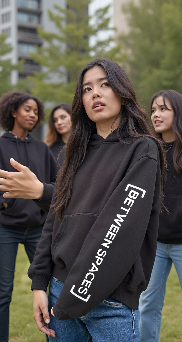
The Final Evolution: Brackets on the Outside
The turning point came through a happy accident. While finalizing the logo, we flipped the brackets to the outside of "Between Spaces" instead of keeping them enclosed. And suddenly, it clicked.

This simple shift perfectly visualized the brand’s message—that we often keep things inside, but we don’t have to. It represented the balance of holding on and letting go, of embracing transition, and of owning our journey.
I was so confident in the original look that I had already printed hang tags with an earlier version. But when this final iteration came to life, I knew it was the one. It felt right.

More Than a Logo—A Symbol of the Journey
At Between Spaces, we believe in embracing the in-between moments, in growth through transition, and in expressing our true selves. Our logo isn’t just a design—it’s a visual representation of that philosophy.
🔹 Designed in NYC. Inspired by transformation. Proudly made in Pakistan.
And that’s how the Between Spaces logo came to be.